Refining An Old Technique – Editing Infrared Photos With Affinity Photo

As I have stated previously, I have been looking to distance myself from the Adobe Creative Suite for quite some time now. Over the past few months I have made the bold decision to move to a completely new computer with no Adobe software installed at all. In it’s place I have been using a combination of Affinity Photo and Luminar 3. As of this moment I have my fair share of complaints about Luminar, although I can’t say the same for Affinity.

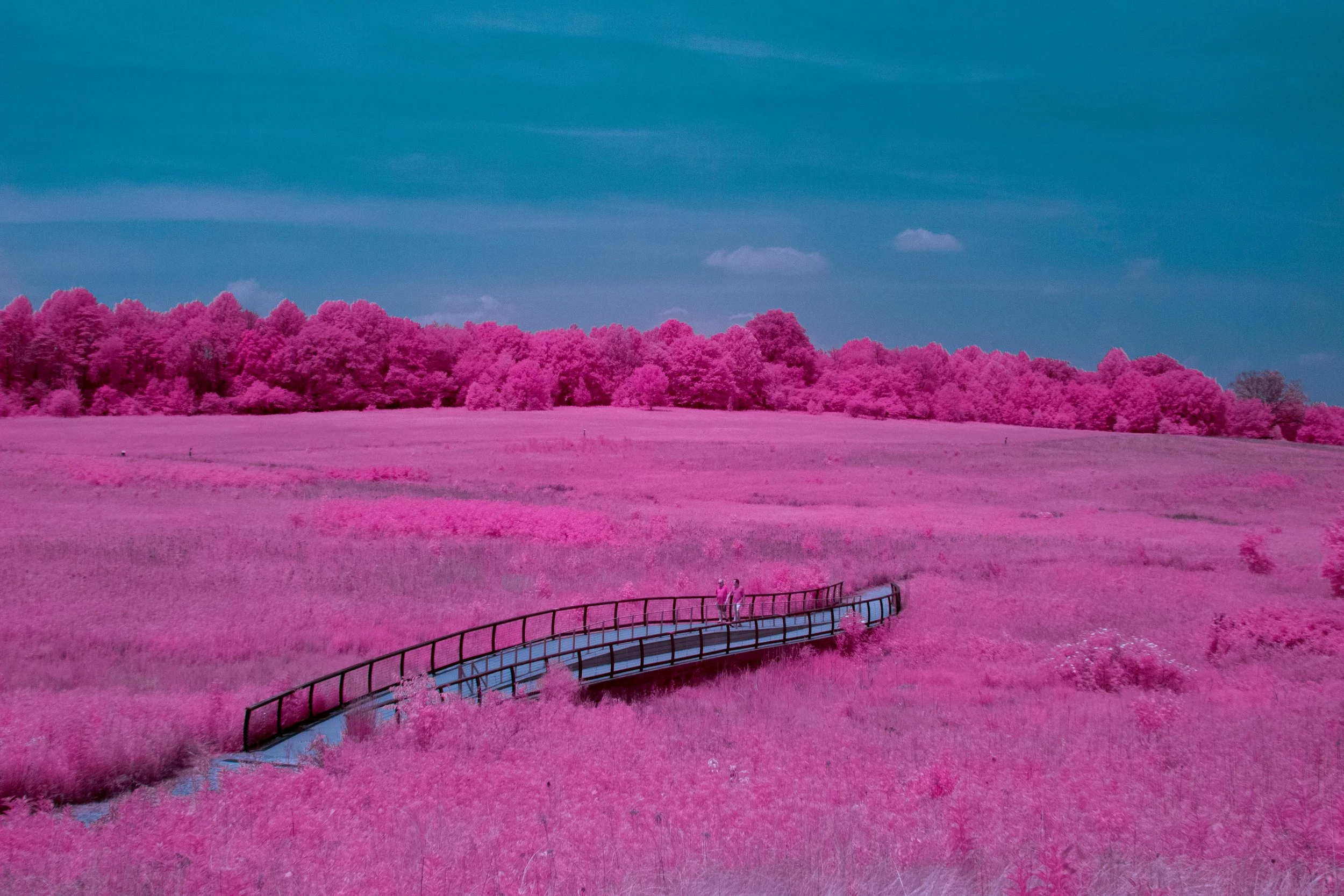
Affinity Photo is an affordable alternative to Photoshop that is incredible for it’s price range. I won’t go into too much detail seeing as this is not a review, but I can say I am having an incredible time learning to use it. Seeing as it is almost time to start taking my infrared camera out, I figured it would be good to practice editing my IR photos with Affinity. At first I thought it was going to be more difficult than in Photoshop, however it turned out to be even easier.

My process for editing IR photos has always been a little complicated ever since I started this little project. For years I have had the unfortunate pleasure of being stuck using an outdated version of Photoshop and Lightroom. My reasoning was pretty rational, I didn’t want to pay a monthly subscription fee for Creative Cloud. As a result I have been stuck using Photoshop CS6 ever since 2012.

Naturally, using outdated software was starting to show it’s drawbacks. For example, Photoshop CS6 wasn’t capable of recognizing the white balance information from my Canon .CR2 files. Indeed I would set my white balance in camera and than import the file into Photoshop, once imported all of my settings were instantly wiped. This is especially frustrating for someone using a custom white balance with infrared in mind. The resulting images were plagued with too many red tones. It got so bad that the default white balance presets in Photosohp were not strong enough to correct the problem. I ended up having to download an external program in order to create a custom white balance preset just to be able to view the file as it was shown in camera. On top of that, my outdated software didn’t even recognize my newer .CR2 files coming off of my Canon T5. This required me to use yet another additional piece of software to convert my .CR2’s to .DNG’s. Needless to say, I was finished.

In camera white balance (Left) VS Output DNG (Right).

In camera white balance (Left) VS Output DNG (Right).

Upon switching to Affinity photo all of these problems were instantly solved. My newer files were recognized, with the correct white balance at that! There was no need for additional software to fix any issues. It even managed to handle color correction better. I can easily say that something that used to take my 45 minutes to finish with Photoshop and Lightroom now only takes 15. I am ecstatic.

The Affinity develop module (similar to Adobe Camera RAW) although good, doesn't quite compare. This however is totally forgivable when I can easily develop presets to conduct my red/blue channel swap. I know this could be done easily with Photoshop, however I just really like the way it is handled in Affinity Photo. For everything that Affinity lacks, it more than makes up with how it improves my workflow. Throughout the year I plan to devote more time to exploring Affinity Photo. Who knows, I might even create some tutorials in order to help people switch.

Today’s photos were just an exercise in order to familiarize myself with my new workflow. I will include my final results below. I feel like these look very nice considering I was trying out completely new software. As always, I hope you enjoy.

I have been hard at work on other projects as of late. I have a new website dedicated to exploring books and history. Feel free to check it out at http://topshelfbookclub.com .

Previous posts about Infrared Photography:

A CAMERA THAT SHOOTS INFRARED - A BRIEF GUIDE TO IR PHOTOGRAPHY - SAMPLE IMAGES – 3/2/17

INFRARED NATURE WALK – 5/3/17

INFRARED LANDSCAPES 5/2/19 - INFRARED PHOTOGRAPHY

Previous posts about switching from Adobe:

ON THE ROAD TO DITCHING ADOBE. A REVIEW OF LUMINAR 3, A SENSIBLE REPLACEMENT FOR LIGHTROOM.

Watch Photography Study - 12/28/16

Today I decided to practice some watch photography techniques. The main goal of this project was to create an image that would resemble a magazine ad for a wrist watch. 

The setup for this shot was pretty simple. I attached my watch to a tripod and placed my camera directly above it. As for the lighting I used a single flash which was diffused by a white sheet. Additional light was provided by a flashlight held at arms length in various positions to fill in additional details. 

I ended up with around five shots with lighting set for specific areas of the shot. The shots were then combined in Photoshop in order to create the final image.

There are two different versions of the final image. One with just a plain black background, and the other with a fabric background superimposed in the background.

This project was a lot of fun, and I intend to expand upon it in the coming weeks.

As always any feedback is greatly appreciated. I hope you all have a great day and a great new year.  

Final Image With The Fabric Background.

Final Image With No Background.

"Kaleidoscopic Psychoactivity" - 9/21/16 - [Photomanipulation]

The initial idea behind this photo was to create a colorful poster using the same techniques used in last weeks image

This particular composition is made up of two photographs combined together, along with extensive amounts of photoshop manipulations.

Take a look for yourself.   

I eventually plan on selling large prints of this image, so definitely let me know what you think.

If you have any questions on how the final product came to be, I would be more than happy to elaborate in a video tutorial.