
I’ve been inspired to try something a little strange. I recently discovered a blog about infrared photography called hiddenrealms.ch. This gentleman posts regularly about trying to digitally recreate Kodak Aerochrome using some rather odd filters. After reading this post about an agricultural surveying filter I decided to try his techniques myself.
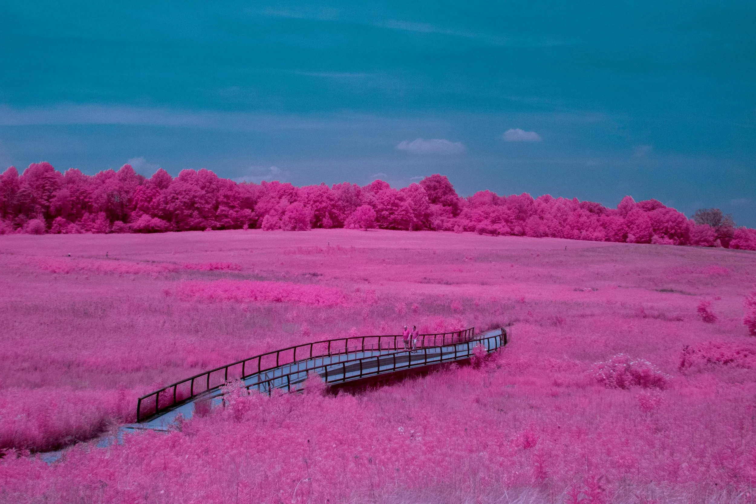
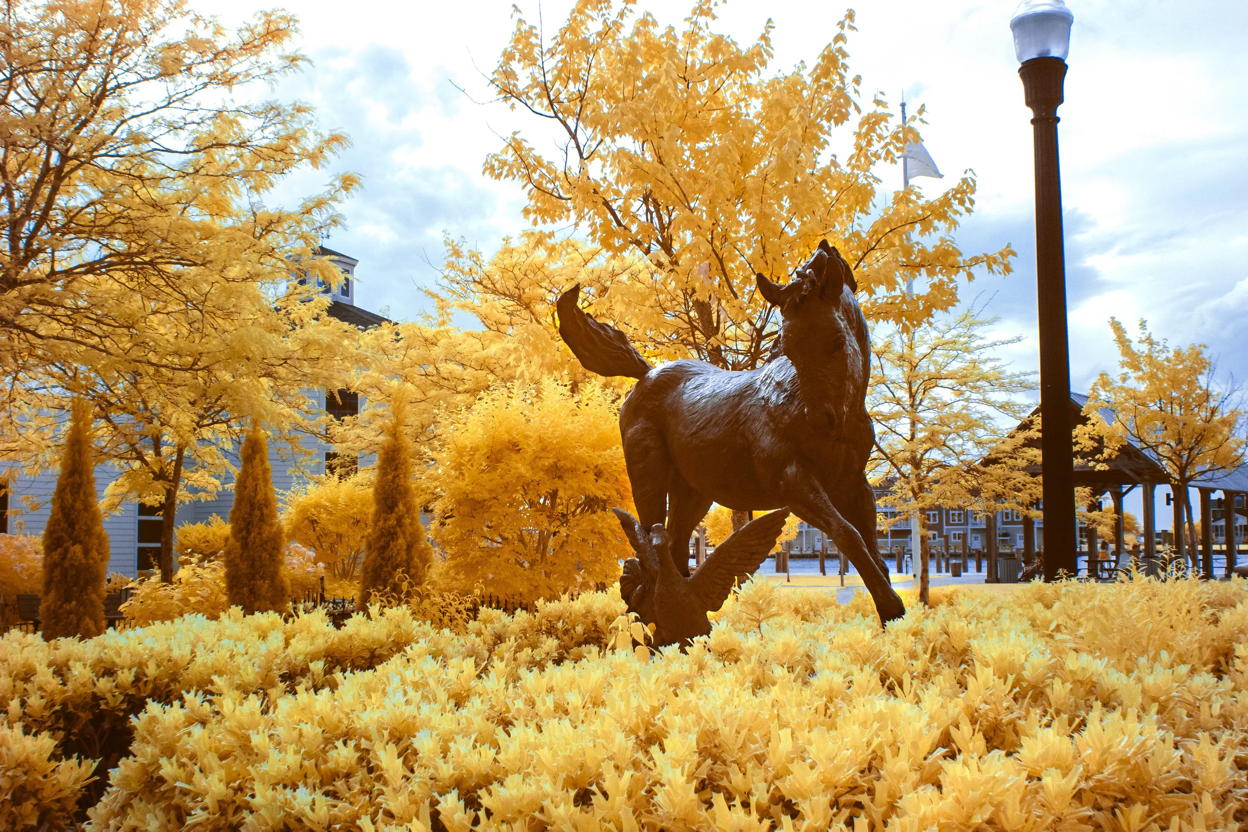
Here are the results, we have a dark blue sky with a reddish/pink hue on the foliage that gives an absolutely breathtaking scene. The following photos were taken at the Sidling Hill visitor center on I-68 heading west towards Cumberland MD. The weather was perfect, bright sun at midday with minimal cloud cover.

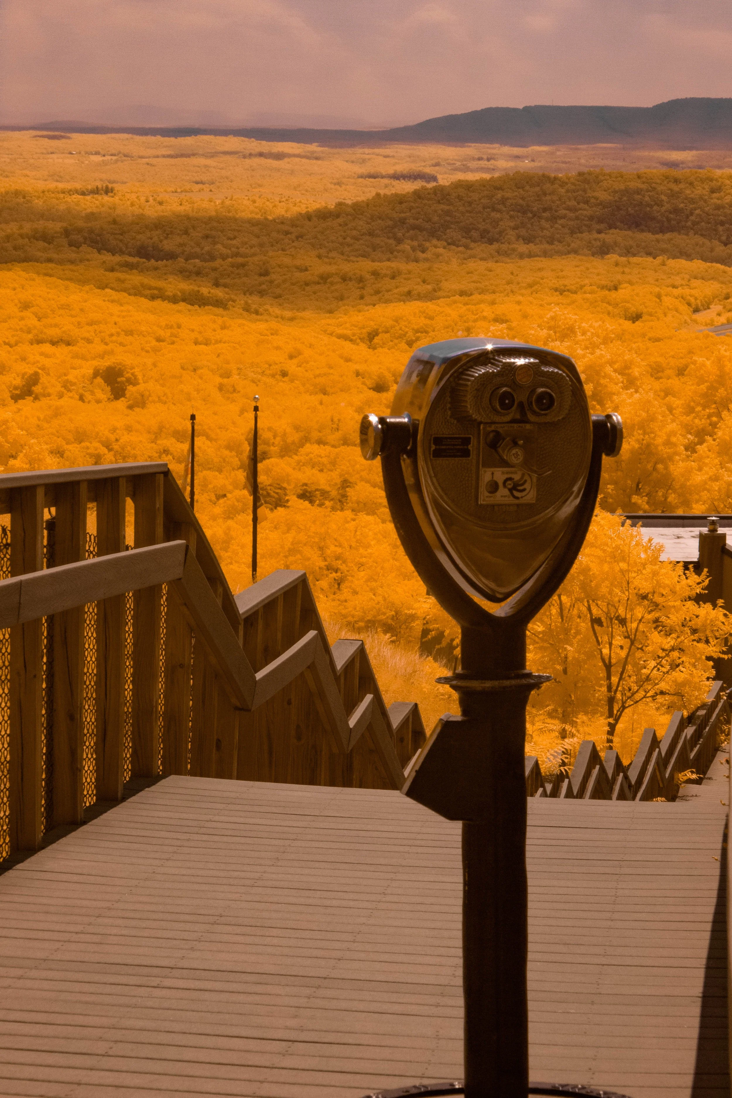


The images above were taken on my full spectrum Canon 1200D with a Minolta MD Rokkor-X 45mm f/2 lens. The thing that made this possible however, is the Mindopt TB550/660/850 Triple Bandpass Green+Red+850nm NIR filter. While this filter might have a long and unassuming name, I can assure you the results it gives are more than you would expect.

The Mindopt Triple Bandpass filter as I will now be referring to it, is a proprietary filter designed for agricultural surveying. It passes several unique wavelengths of light that make it perfect for obtaining the look of red trees and blue sky. As the name would suggest that would be 550nm, 660nm, and 850nm. This equates to only passing red and green visible light as well as pure infrared at 850nm.


Similar to consumer grade infrared filters, you will need to swap your color channels in Photoshop in order to get the results shown above. For this filter I suggest swapping the red channel to blue, the green channel to red, and the blue channel to green. Then with a few white balance corrections and some fine tuning in the hue/saturation panel, you have an amazing image.
I mentioned before that this is a proprietary filter. This means unfortunately that regular consumers cannot buy this from the manufacturer. There are websites that will sell you one, however they will be quite expensive. I happened to get lucky by finding one on eBay for around $30, however it came with a huge drawback.
The filter I purchased is only 24.5mm long. In other words it’s very small, about the size of a dime. In order to mount the filter in front of my lens I ended up using double sided tape to tape it to the front of an old skylight filter I had laying around. The end result is a very strange looking filter that can only cover a small portion of the lens. This means that I am unfortunately limited to an aperture of around f/11.


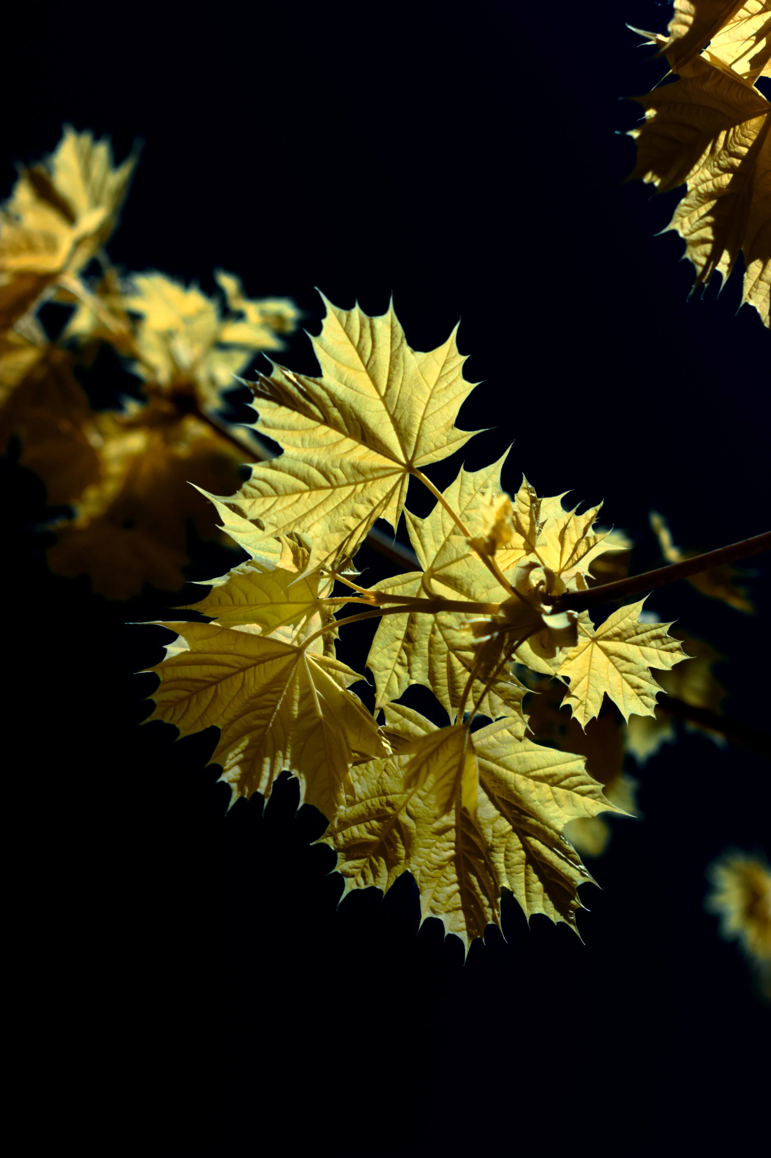
Despite all the limitations, I had an amazing time with this filter. I couldn’t be happier with the results. One thing I was particularly impressed with was the range of colors I could get. Not only does it work great for red’s, but it gives a spectacular yellow as well. I only wish I could find a larger version of the filter so I wouldn’t be as limited.


Below are two images of the same scene taken moments apart from one another on different cameras. The first is a visible light photo, the second is with the triple bandpass filter.


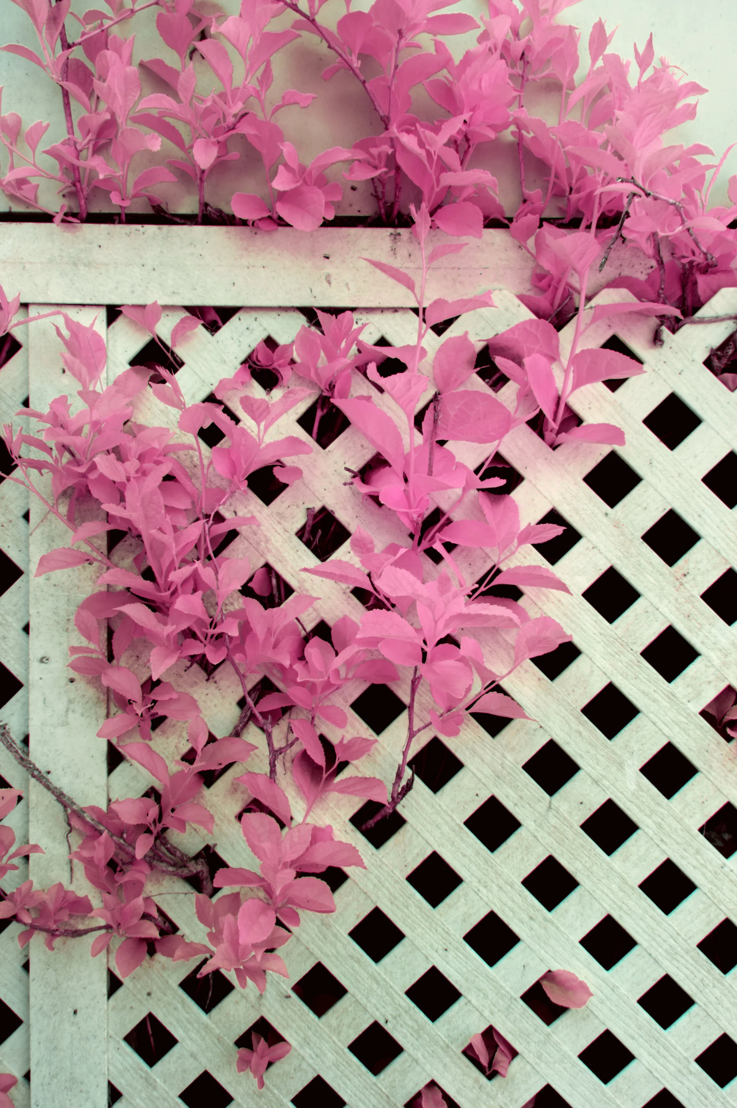
If you want to get similar results to this I also did a comparison using the Kolari Vision 550nm filter. This seems like the only readily available option that will produce a similar result. Both images were shot at the same time and processed with the same red-blue, green-red, blue-green color swap.


While I love the colors the 550nm filter produces, it seems to lean more toward pink and less toward red. I also think the triple bandpass filter has a greater range of colors you can change to. More deep reds and yellows etc. However, the small size of the triple bandpass filter and it’s general unavailability make it a less desirable option for most photographers.
In conclusion, I had a really fun time with this experiment. I hope to continue shooting with this filter into the future. And I think this will open my up to finding filters from more obscure places.